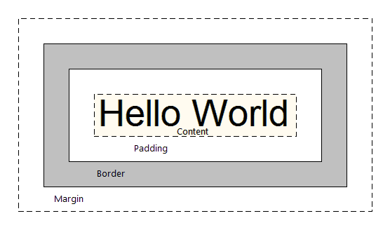
According to CSS, every element on your web page fits into a box. This is known as the CSS Box Model.
Understanding the CSS Box Model will help you lay elements out on your page. It will also help you understand how the elements will react to one another.
An example box with an unspecified width.
The containing block of this page allows for a maximum width of 800px. Our box will stretch to fit that.
In CSS, the width of the box is only the width of the content. To calculate the actual amount of horizontal space the box will take up, we have to add the margin, border, and padding amounts for each side.
The content of the box above is 200px. However, we have margins, borders and padding on the left and right of the box. Firebug can easily show us this.
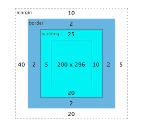
By adding all of the margin, borders, and padding on the left and right of the box to the specified width of 200px, we get 264px. The width of the above box is 200px, but the actual amount of vertical space it takes up is 264px.
If we wanted this same box to fit into a space of 400px, we would have to calculate the box width.
	400 total pixels
	-15 total padding
	- 4 total border
	-45 total margin
	----------------
	336 pixel width
This will become very important once we start getting into advanced CSS layouts.