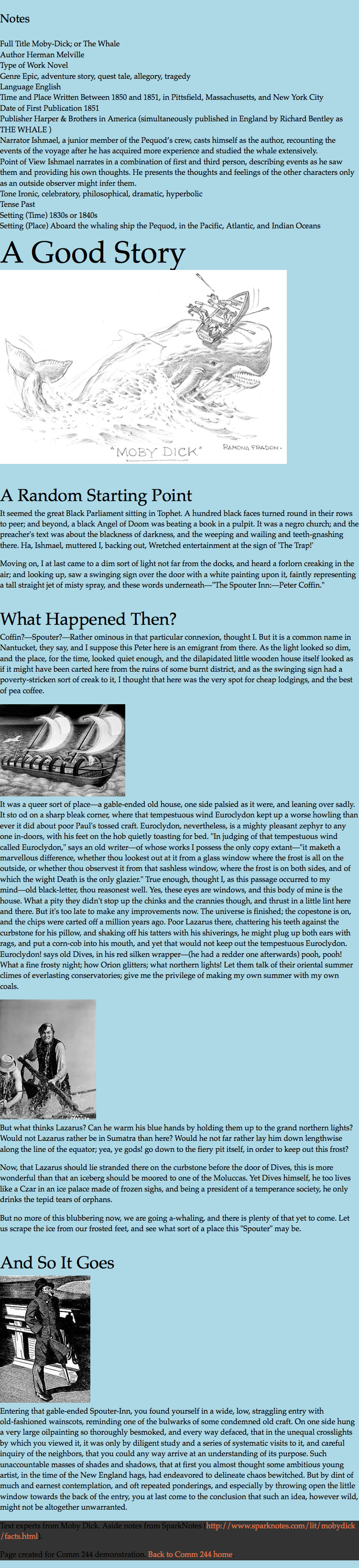
Moby Demo
Download the demo files
- Download the zip folder containing the Moby demo files from the Week 6 page of the class website. It should be called
moby-start.zip. - Move the zip file into your Sites folder
- Unzip the folder
Inside the moby-start folder you should see a very basic, one page website.
- All the images are inside
images - Both the CSS reset and styles file are inside
css - There is one html file called
index.html
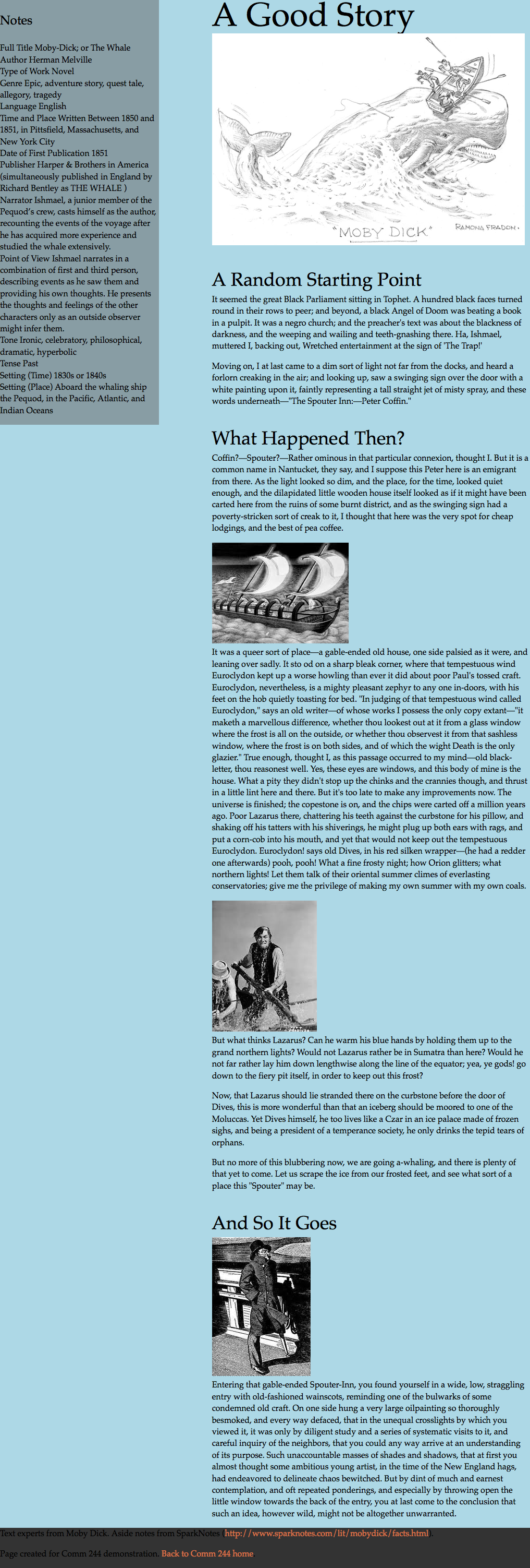
This page is an excerpt from Moby Dick with some notes on the site. The footer contains a few links.
Set up some very basic site styles
- Spend some time familiarizing yourself with the html in
index.html - Link both the stylesheets to
index.htmlas external stylesheets. - Create some basic type styles for the site in
styles.css:- Pick a font stack (at least 2 typefaces in addition to a CSS fallback keyword)
- Set the type size to 1em and the leading to 1.4
- Set the h1 type size to 4em and the leading 1
- Set the h2 type size 2.25em and the top margin to 1em
- Set the h3 type size 1.5em and the top and bottom margins to 1em
- Set the bottom margins to 1em for p, ul, and ol
Basic Page Layout
Now that we have some basic text styling, we'll start to lay out our page.
Up until now we've made web pages with elements that obligingly stack down the page. To create more sophisticated layouts and visually appealing sites, we need to learn more about page layouts with CSS.
Dimensions for our demo
- The main content should take up 60% of the page width
- The aside content should be on the right side and take up 30%
- The footer should take up the full page width and sit at the bottom of the page.
First, start by adding background colors to each major section. You can use the colors listed or a color of your own choice.
bodybackground (Ex. lightBlue)asidebackground (Ex. rgba(100,100,100,.5) )footerbackground (Ex. #333)
This should help you see each section clearly.
Introducing float
The float property is used to remove an element from the normal document flow and push it to the left or right edge of the containing element. This was originally intended to allow designers to align images within text.
However, the float property has also been used (some might say abused) to be one of the most common ways to lay out the elements on a web page. Modern CSS modules have introduced fully fledged layout modules called flexbox and grid, however these are still new and gaining support (especially grid). Creating layouts with floats is still a very common technique.
One important rule to remember when creating a layout in CSS, is to always specify a width on each element you float. This keeps the layout simple and avoids common browser bugs.
To create fully responsive layouts, use % for widths when possible. If more control is needed, use rem or em. Avoid using pixel widths.
Float the aside
In our demo web page, we want the aside block to display as a on the right side of our page.
To do this, assign a width to the column and set the float property to a value of right.
aside {
  float: right;
  width: 30%;
}
This should move the entire aside block all the way to the right of the page and set it to be 30% of the total page width. Try resizing your browser window to see it changes sizes.
Main Content
Notice how the main content now stretches underneath the end of the aside (if you don't, make your browser window more narrow). The default behavior of a floated element is that content flows around it.
In this case, our article text is flowing around the floated aside, which creates an undesirable visual effect. We want our aside to fill the whole height of the page.
We can add a width to the article to keep it from flowing around the aside.
article {
   width: 60%;
}
Our article and aside no longer overlap because of the widths we set. The article will take of 60% of the page starting from the left. The aside will take of 30% of the page starting from the right (because of the float). This leaves a 10% gap between the two elements.
In this case, we have the aside floated to the right. What if we change our minds and want the aside on the left instead?
We could reverse the float by changing the direction our aside is floated.
aside {
  float: left;
}
Notice how the content doesn't move fully to the right of our aside. This is because even though our aside is floated, it's first in the source order of our HTML file. The aside will stay to the left and any non-floated content after it will flow around it (as long as it fits within the width).
Since we've set our article to be 60% of the page width, only some of the content will be able to flow around the left aside.
In order for our content to display on the right side of the page, we have to float it to the right.
article {
  float: right;
  width: 60%
}
While we've fixed the issue of the columns not displaying correctly, we've introduced a new issue. The footer text has now snuck up to the top of the page to settle into our gutter. The footer background is also affecting the whole page. What in the world!
Footer Content
Now that we've added a float to both the main content and aside, when our page is wide enough, the footer sneaks to the top of the page.
This is happening because we've now floated all of the other elements on the page other than the footer. Doing so removes them from the normal document flow and allows un-floated elements to flow around them.
Clearly we want the footer to stay at the foot of our document and get out of the gutter.
We can fix this in two primary ways.
- Add the
clearproperty to the footer - Float everything
Both approaches work.
Add a clear to the footer
The clear property declares that the element should not flow around floats, also known as clearing floats. While there are quite a few possible values, three are the most common:
left: Do not flow around floats on the leftright: Do not flow around floats on the rightboth: Do not flow around floats at all
Since we want our footer to not flow around floats on either side, we'll set the clear property with the value both.
footer {
  clear: both;
}
This clears floats on both the right and the left of the element.
Float everything
Instead of using the clear property, we could have also taken another approach. Floated elements won't flow around each other in the same way as an un-floated element flows around a floated element. We can take the approach to simply float everything on the page (or at least all the major containing blocks).
Make sure to remove the clear property.
Set the footer to float to the left and give it a width to stretch across the entire page.
footer {
  float: left;
  width: 100%;
}
Breathing Room
Everything on our page is hitting the edges of the browser window. We need some breathing room around our pages. Add some margins to the body.
body {
  margin: 5%;
}
That gave us space around our page, but also messed up the footer. Our footer background should stretch to the edge of the browser window.
We need to add a margin to the main content and aside, but not the footer. This is easiest to accomplish by wrapping the main content and aside into one element that we can style.
divs to the rescue
Since we do not currently have an HTML element that contains both the article and the aside. We need to add some markup to our HTML. This is the perfect opportunity to use a div, because we only need the element as a target for our CSS.
- Add a
divto the HTML that wraps around both thearticleandaside, but not thefooter. Give thediva class ofcontainer. - Remove the 5% margin from the body element.
- Add a 5% margin to the
containerclass.
.container {
  margin: 5%;
}
Swap content and aside
Adjust the CSS floats so that the content is on the left and the aside is on the right.
Adjust padding on major elements
Your web page should now have the main content on the left with the aside creating a column on the right.
Add some padding and margins our major elements. Make sure the text color of the footer is readable.
footer {
  padding: 50px 5% 25px 5%;
  margin-top: 100px;
}

aside {
  padding: 1em 3em;
}
Notice how the width of the sidebar is now much wider than it was before.
This is because of how the default CSS box model works. The default box model is content-box.
We have added padding to our layout elements: aside and footer. This increases the total width of the footer and aside boxes (padding gets added to content width in the content-box model). Now the total width of our boxes is over 100% of the page width, causing our content to drop down the page at narrower widths.
Messing with the content-box
The way CSS calculates the widths of elements using using the default content-box setting is unintuitive and confusing. The most popular approach these days is to use a reset to change the box model to the more intuitive border-box setting.
Using the border-box reset
When using border-box, the total width of the element is the same as the content width. In practice, border-box will usually cause element widths to behave how we naturally expect them to.
The "border-box reset" is a few rules that cause the default box-sizing of your elements to use border-box. It also attempts to maintain compatibility with other modules that might expect the older content-box setting.
Add the border-box reset to the top of your stylesheet, after any reset code. (See notes page on the CSS Box Model for reference)
html {
  box-sizing: border-box;
}

*, *:before, *:after {
  box-sizing: inherit;
}
Image resizing and aligning
Image Size
When we make our page small enough, our first image breaks the page layout. It can no longer fit into 60% of the page width, so the image overlaps the other content. Obviously this can't happen on a site.
We need to ensure that the image never becomes wider than the container it is supposed to fit into. We can do this with the max-width property.
img {
  max-width: 100%;
}
Image Alignment
Our images are all on the left and breaking up the text flow. We want them to float to one side or the other and flow inline with the text. Floating the img does this.
img {
  float: right;
}
Now the images are flowing inline with the text, but now every image is floated to the right. We probably don't want this.
A perfect case for a class
We want to be able to decide if an image should float, and also to what side. The best approach is to use a generic class. We could also use the class on other elements, like a future pull quote.
- Remove the
float: right;rule you just added. - Create a new class selector called 'align-right' and add a property of float with a value of right.
- In your HTML, add the
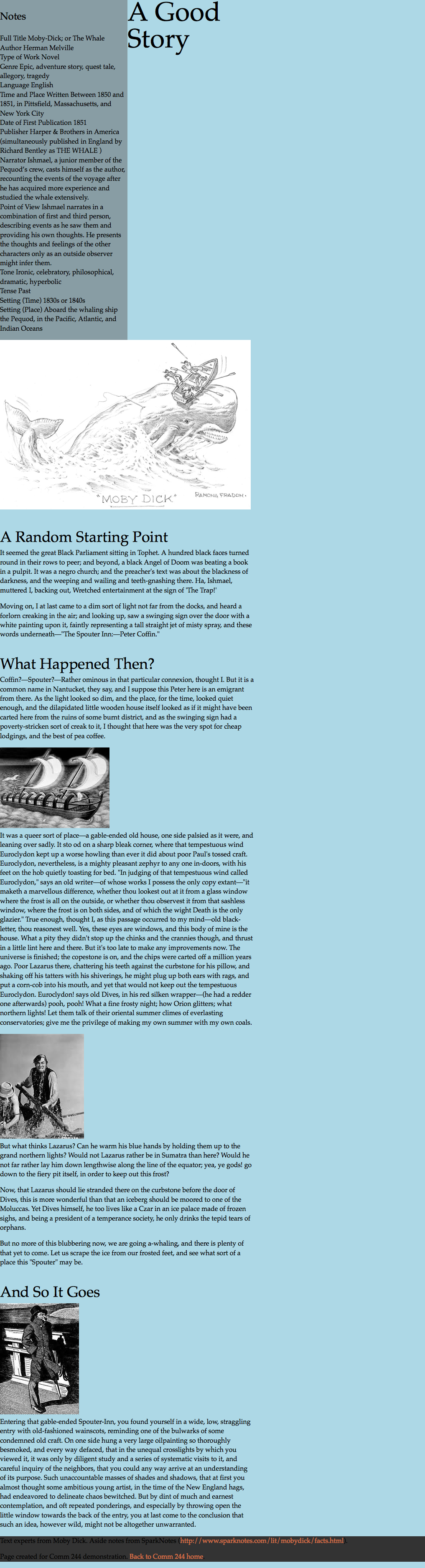
align-rightclass to the second image on the page.
You should now see the second image aligning to the right of the content while the final two are still on the left.
We should also add some margins to our class so that the image doesn’t bump against the text.
- Add a margin on the left side of 1.5em:
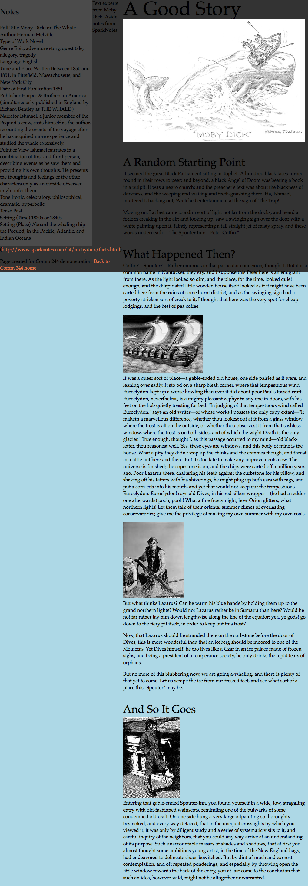
.align-right { float: right; margin-left: 1.5em; } - Create a second class selector called 'align-left' that has similar settings except aligns to the left.
- Apply either class to each image in the HTML to float it.
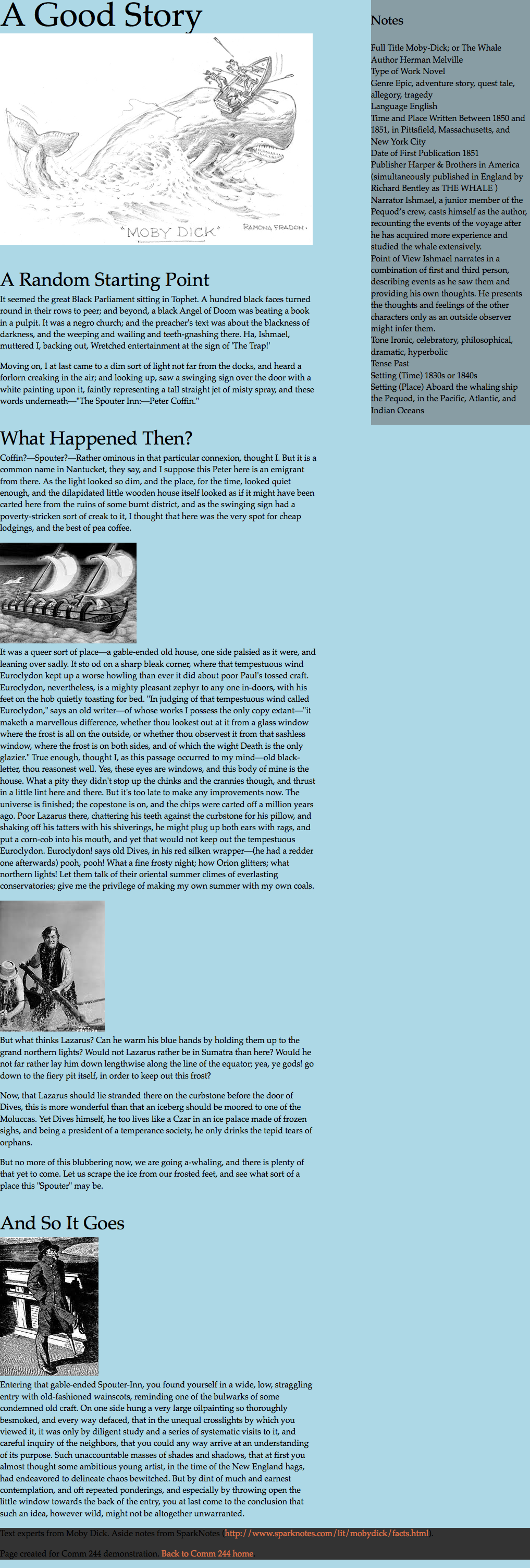
- Do not apply a class to first image. It should not be floated at all.
Aside
Aside heading
- Add a bottom border to the aside heading. It should be 2px thick, solid, and use a transparent black color (
rgba(0,0,0,.4)) - Adjust the line-height to make the border move closer to the heading.
Aside Text
In our aside, we’ve used an unordered list to display each definition. Each definition label is simply marked with strong.
<li><strong>Full Title</strong> Moby-Dick; or The Whale</li>
<li><strong>Author</strong> Herman Melville</li>
<li><strong>Type of Work</strong> Novel</li>
strong is an inline element, so our list items each display in a line, with the label and definition on the same line. If we wanted the labels to display on their own lines, we could change the HTML to use a block-level element to make our term labels each be on their own lines, but that sounds like a lot of work to change all the HTML.
It's much easier to use the display property in CSS to change the behavior of strong. We're making sure to add aside to our selector to only target strong elements in the aside.
aside strong {
  display: block;
}
Now each term label displays on its own line.
- Make the term labels bold.
- Add a margin to to top of each term label for added definition between terms.
- Make the font-size of the term label 1.2em for added emphasis.
At this point, it may feel like all of the sidebar text is a bit large. Since we’re using em’s, which are relative units, we can actually just scale down all of the text of the aside in one declaration. Remember, ems are calculated relative to the size of their parent containers.
aside {
  font-size: 90%;
}
@font-face
Use typefaces from either Adobe Fonts or Google Fonts to improve the typography on your page.
Drop Caps
We can create a drop cap effect at the start of each section by using advanced CSS selectors.
Combine the :first-of-type and :first-letter selectors to target the first letter of the first paragraph in each section.
Once you’ve figured out the selector, you'll need to fine tune the drop cap display. The key properties to adjust are:
- font-size
- line-height
- float
- padding
This will take some playing around to get the effect you want. I suggest using the Web Inspector to get the effect right.
Think about other visual effects your drop cap might have.
Add other effects
Using the notes from today’s class, add other effects to the page. Include:
- box-shadow
- text-shadow
- border-radius
Also work on refining the typography and colors.
Upload to your web space
When you have completed all steps, upload the entire project folder to your Simmons web space. Link to it from your class website as part of the class 6 activity.