CSS Grid is designed to simplify laying out webpages using CSS. This is a dramatic improvement over what we've used in the past.
CSS Grids:
Just like with flexbox, a grid is created by changing the display property of a parent element. This element becomes the grid container and defines the context for grid formatting.
To create a grid container change the display property to grid:
.grid-container {
   display: grid
}
I'm using a class of 'grid-container' in this example, but we could use any element, class or id for the grid container.
Once we declare a grid container, all immediate children of that element become grid items. Only children, not descendents, are grid items.
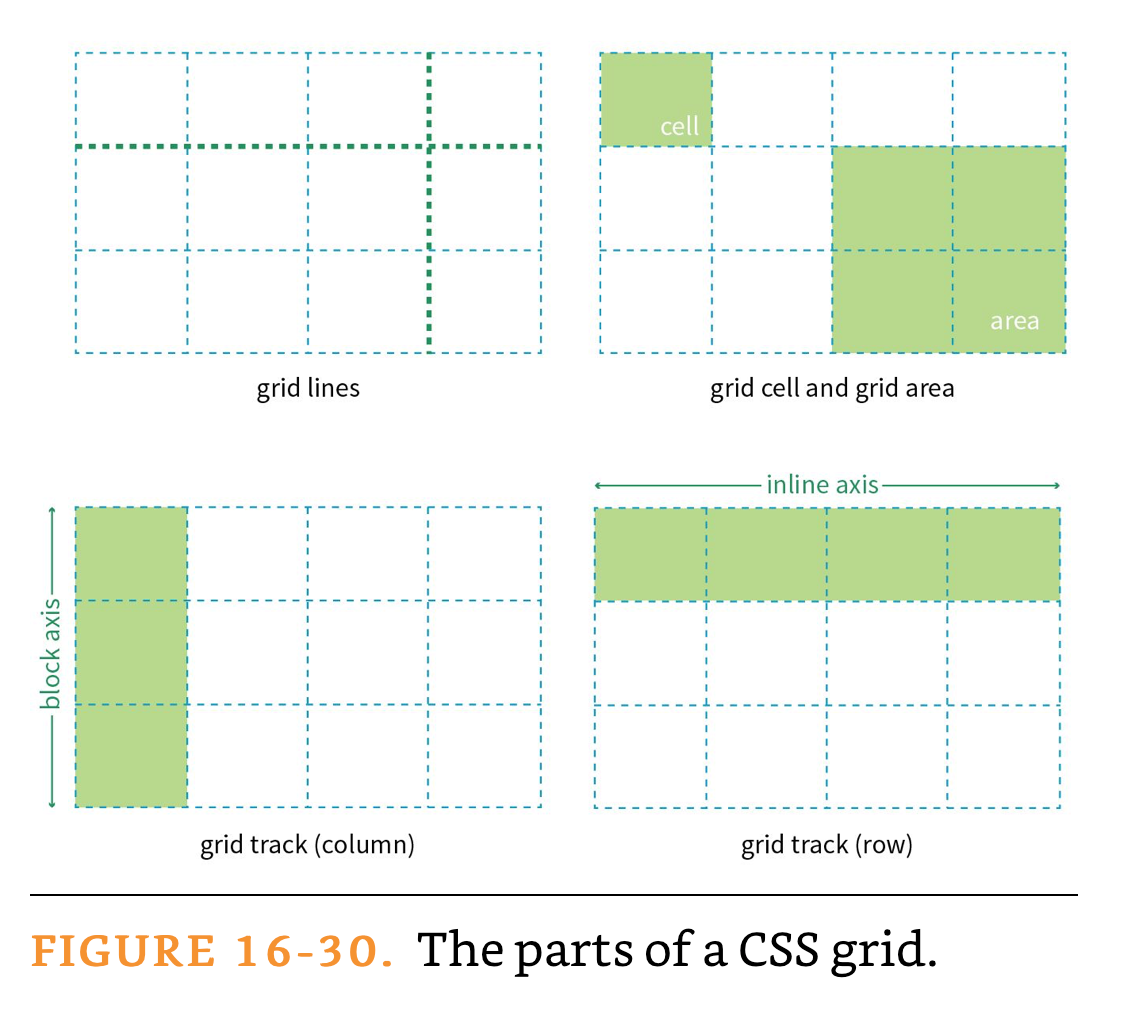
The primary parts of a grid are:

Definitions from Learning Web Design
Grid rows and columns are known as tracks. In order for our grid to work like a grid, we have to establish sizing rules for our rows and columns.
Track sizes (rows and columns) can be specified using any of the following values:
The values can be applied to either of the grid-template-* properties:
grid-template-rowsgrid-template-columnsFractional units are a new unit designed specifically for CSS grids. These units can be considered a ratio.
The following example will set the middle column to be twice the size of the first and third columns:
.grid-container {
   display: grid
   grid-template-columns: 1fr 2fr 1fr;
}
This example makes each column proportionally larger:
.grid-container {
   display: grid
   grid-template-columns: 1fr 2fr 3fr;
}
Best of all, fr units can be mixed with fixed units such as pixels and ems. This is great for maintaining fixed content areas for things like ads.
The browser first assigns space for the fixed measurements and then calculates the fr units.
.grid-container {
   display: grid
   grid-template-columns: 1fr 2fr 250px;
}
See also: The FR Unit (MDN)
The minmax() function can be used in place of a value to define both the minimum size and maximum size of a grid track. You cannot use fr units inside the minmax() function.
.grid-container {
   display: grid
   grid-template-columns: min-content minmax(20em, 50em) max-content;
}
See also:
.grid-container {
   display: grid
   grid-template-columns: 1fr minmax(20em, 50em) 250px;
}fit-content() will use a formula to allow a track to reflow to the minium size when needed but not display larger than the fit-content value.
In this example, the second column will get smaller as needed, but not expand greater than 300px.
.grid-container {
   display: grid
   grid-template-columns: 1fr fit-content(300px) 2fr;
}
See also fit-content() on MDN for a more precise definition and interactive example.
The repeat function allows you to specify repeating patterns of columns.
For example, imagine you wanted 10 columns that alternated between 1fr and 2fr. You could write this:
.grid-container {
   display: grid
   grid-template-columns: 1fr 2fr 1fr 2fr 1fr 2fr 1fr 2fr 1fr 2fr;
}
Using repeat() simplifies this. The first value is the number of times to repeat the pattern while the values after comma demonstrate the patter.
.grid-container {
   display: grid
   grid-template-columns: repeat(5, 1fr 2fr);
}The auto-fill and auto-fit values are quite similar to each other. Both tell the browser to adjust the tracks so that the pattern fits based on the specified height or width. auto-fit will discard tracks without content.
So far we've just seen how to define grids and the browser slots each grid item in one by one. To make grids more useful, we also need to define where and how to place items in the grid.
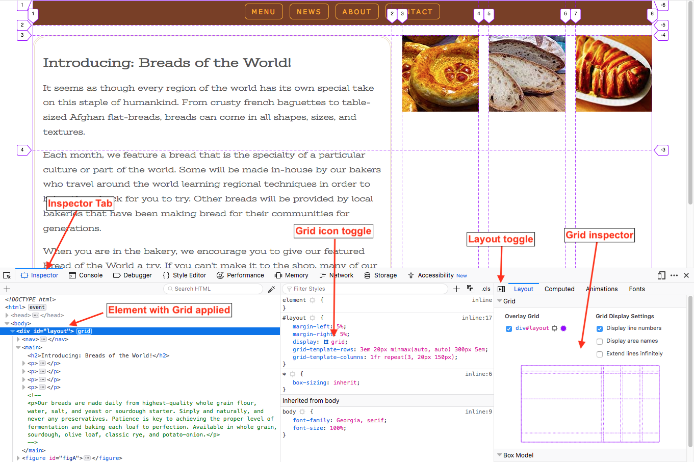
Using Firefox, you can see a visual overlay of any grid by using the developer tools in Firefox. Right now, Firefox has the best developer tools for CSS Grid.

See also: CSS Grid Inspector: Examine grid layouts (MDN)
Elements can be placed on the grid with the following properties:
grid-row-startgrid-row-endgrid-column-startgrid-column-endThe start and end values are identified by counting the grid lines in the grid.
Use Firefox to see a visual overlay of the grid lines.
These values should be applied to individual grid items.
In this example:
Using the criteria above, we can lay out the header with the following CSS:
header {
   grid-column-start: 1;
   grid-column-end: 4;
   grid-row-start: 1;
   grid-row-end: 2;
}
Grid lines can also be counted backwards, using negative numbers. The last line is -1, the second to last line is -2, etc.
When specifying elements to span across all columns or rows, it's easier and more versatile to use -1 for the end value. This avoids counting errors and will work even if the grid lines change.
header { grid-column-start: 1;grid-column-end: -1;grid-row-start: 1; grid-row-end: 2; }
In additional to using the start and end properties for rows and columns, you can also use shorthand values instead to save typing.
grid-rowgrid-columnWe can rewrite the header properties above using this shorthand:
header {
   grid-column: 1 / -1;
   grid-row: 1 / 2;
}Lastly, there is one more shorthand to apply all of the properties.
The order is: "row-start" "column-start" "row-end" "column-end".
This still follows the general CSS rule for listing values in a clockwise order.
header {
   grid-area: 1 / 1 / 2 / -1;
   /* row-start / column-start / row-end / column-end */
}CSS Grid allows you to name both grid lines and areas.
Naming grid lines is covered in Chapter 16 of Learning Web Design
We could define a grid like so:
.grid-container {
   display: grid;
   grid-template-columns: 200px 1fr 200px;
   grid-template-rows: 100px 400px 100px;
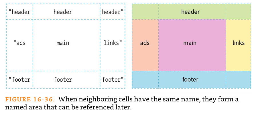
}The CSS property grid-template-areas allows you to name individual grid cells or groups of cells called areas in your grid. These names can be referenced later for placing elements.
Drawing a quick grid helps to visualize this.
We'll use the figure below to set up our names.

With grid-template-areas:
The CSS to create the named areas above would be this:
.grid-container { display: grid; grid-template-columns: 200px 1fr 200px; grid-template-rows: 100px 400px 100px;grid-template-areas:"header header header""ads main links""footer footer footer";}
It helps to align the values on different lines to make the grid more clear
By itself, the page should change. You can hover use the Firefox developer tools to view the grid names.
grid-area
header {
   grid-area: header;
}

main {
   grid-area: main;
}

aside:first-of-type {
   grid-area: links;
}

aside:last-of-type {
   grid-area: ads;
}

footer {
   grid-area: footer;
}