Testing Responsive Images in Browsers
Testing your responsive images in browsers can be a bit tricky since you often need to emulate a device resolution or size. Generally speaking, you can test your images by disabling the browser cache and entering the responsive mode.Google Chrome
- From the Menu Bar: View -> Develop -> Developer Tools
- Go to Settings for the Developer Tools. It's the three dots in the top right of the Developer pane [screenshot]
- Make sure "Disable cache (while Devtools is open)" is checked [screenshot]
- Click the Toggle Device Toolbar button to enter responsive mode [screenshot]
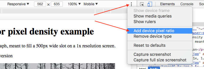
- To show the resolution dropdown to allow selecting a specific screen pixel density, enable the DPR menu. Click the three dots next to in the pane with your page preview and select "Add device pixel ratio" [screenshot]
- Toggle the DPR and device type to see how your images react. You will probably need to reload the page each time.
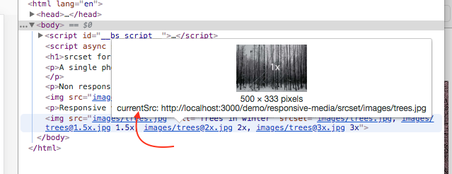
- To see which image has actually loaded, hover over the srcset attribute values in your images under the Elements tab. A popup will show you the "currentSrc" image [screenshot]
Learn more about Responsive Dev Tools for Chrome
Mozilla Firefox
- Disable the cache
- Open the Developer Tools: From the menu bar, click Tools -> Web Developer -> Toggle Tools
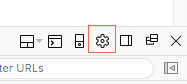
- Click the Settings button in the Developer Tools [screenshot]
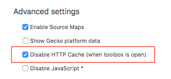
- Check the option for "Disable HTTP cache (when toolbox is open)" [screenshot]
- Enter Responsive Design Mode. From the menu bar, click Tools -> Web Developer -> Responsive Design Mode
- Toggle the DPR and device type to see how your images react. You do not usually need to refresh for the images to update.
- To see which image has actually loaded, click the Network tab in the Developer Tools. Look under the list of files for your image to see which was loaded. Refresh the page to get a fresh view. [screenshot]
Learn more about Responsive Dev Tools for Firefox
Apple Safari
- Enter Responsive Design Mode: From the menu bar, Develop -> Enter Responsive Design Mode
- Toggle the DPR dropdown (unlabeled) and device type to see how your images react. You will need to reload the page each time. [screenshot]