Week 4
Notes
February Google Doodles
Flexbox (Continued)
Viewport
Responsive Design
Web Icons
Relevant Library Code
Reading
Read for week 5:
- Chapter 1 of Designing for Touch by Josh Clark (Google Drive )
- Chapters 4 & 5 (pages 49–84) of Mobile First by Luke Wroblewski (Google Drive )
- A Room With a Viewport (pages 82-84) from Responsive Web Design by Ethan Marcotte (Google Drive )
Homework
Flexbox Layout Exercise with Media Queries
Complete the layout exercise from class and add a print stylesheet.
Complete exercise instructions:
- Copy the source code from the flexbox holy grail layout example and create a new html document.
- Without changing any HTML, modify the CSS to use a mobile first approach by making the existing styles format the document to match the small screen picture
- Add a media query and styles to format the document to match the medium screen picture at medium sizes
- Add a media query and styles to format the document to match the large screen picture at large sizes
- Add a media query and styles to formate the document to only print the elements shown in the print picture
- Use the print preview window in the browser to see how the print stylesheets are working
- BONUS: Add styles to improve the margins and type size when printing
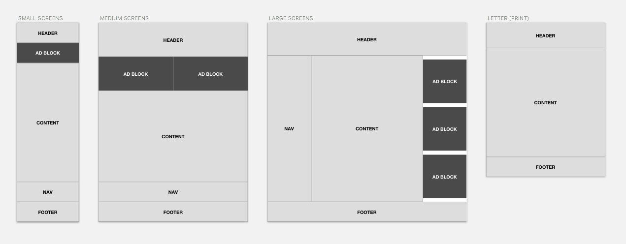
When you are done you should have a single web page that responds to three different breakpoints with layouts that match the pictures above. It should also have a separate layout for print.
Post your final example to your class website.
Tell a story with a single page website...
Craft a story about the Olympics. The exact subject of the story you create is up to you. You will be working with this story for the next few weeks to create a single page website. In order to ensure that your webpage has enough content, you should make sure your story has at least four "sections" to it.
Complete for next week:
- Write your story
- Develop thumbnail sketches for your design for each of the three sizes
- Create a draft of the design in Sketch. Start with the smallest size and move forward. You do not have to have a 100% finished mockup in Sketch, but you should have enough completed to review in class next week.
Begin by focusing on the most important content and delivering that to the smaller screen sizes. Focus on making the content clear, accessible and beautiful on the small screen.
Do not worry about whether or not you think you can code your navigation system or design at this point.
Post your thumbnail sketches and Sketch layouts (export as pdf) to your class website