Simmons Layout Exercise
As an assignment you were asked to recreate a simplified versions of the Simmons Academics page.
CSS & Markup Solutions (for previous homework)
Below are possible solutions for your assignment to recreate this page.
- Basic HTML Markup - contains no CSS or additional classes used for styling
- HTML Markup with Basic CSS Styles - type styles and color done in CSS
Use the Web Inspector or View Source to look at the HTML and CSS for the pages.
Boilerplate CSS
You'll want to start by ensuring that both the normalize stylesheet and the stylesheet you downloaded (with typefaces and colors) are attached to your document.
You should also add both the box-sizing reset and the clearfix hack to the CSS. You'll use both of them when laying out the document.
Creating the Layout in CSS
Download the starter pack with the HTML and basic styles already finished.
Identify Page Sections
The first step to creating a web page is to identify content sections or chunks. You should have done something similar to this when writing the HTML for the page.
Go through the screen shot (or mockup) and identify content areas. Start with the major sections and then look at related or similar sections within those chunks.
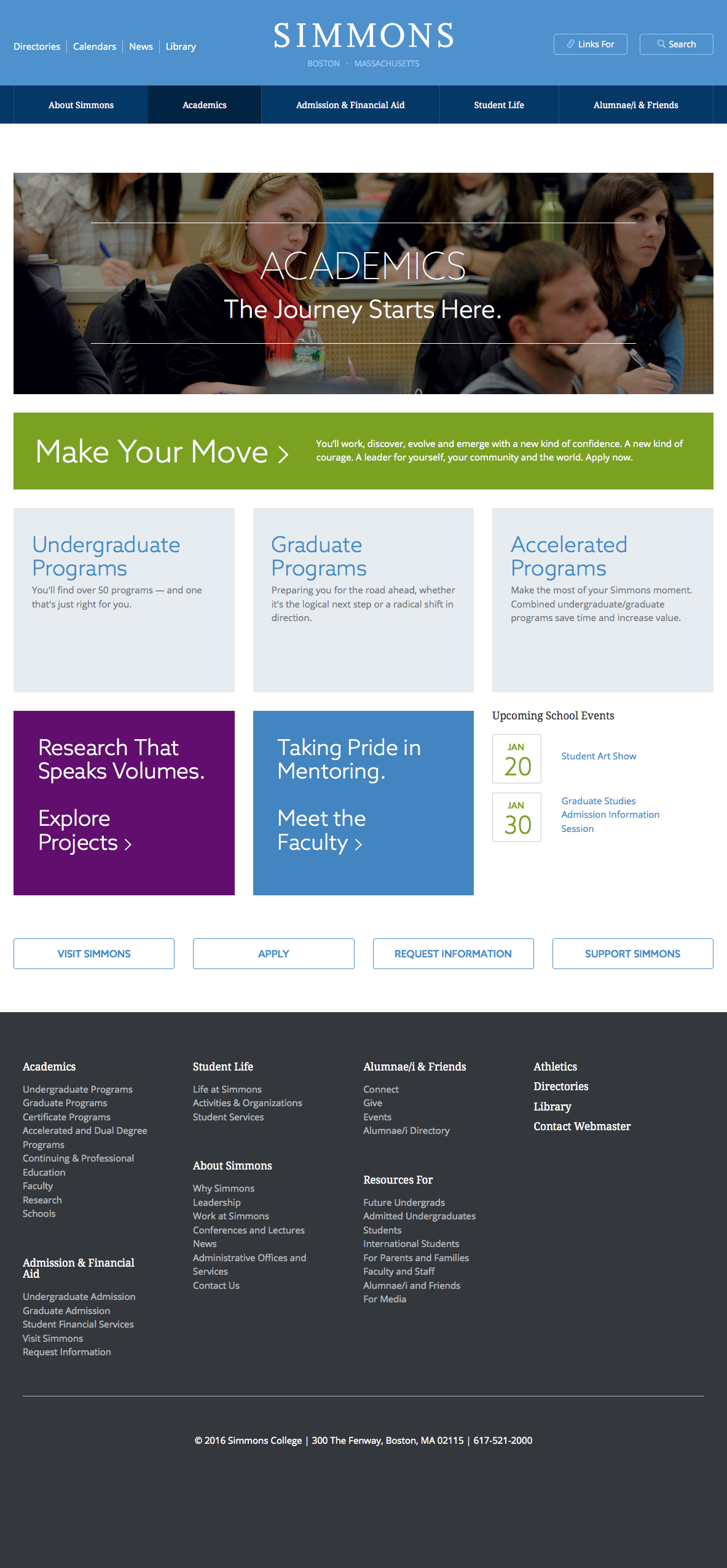


Outer Page Structure
Based on the screen shot, you should notice that the backgrounds for the header, navigation and footer all stretch to the edges of the page. The main content area however does not. This indicates that we will have to use some form of "stretch" layout technique to allow use to center the page while still having the background colors stretch to the edges of the page.
<header>
  ...
</header>

<main>
  ...
</main>

<footer>
  ...
</footer>
We'll use the container class to center our content, while adjusting its location based on whether we want the background to stretch to the end of the page.
<header>
  <div class="container">
    ...
  </div>

  <nav class="main-nav">
    <div class="container">
      ...
    </div>
  </nav>

</header>

<div class="container">
	<main>
	  ...
	</main>
</div>

<footer>
  <div class="container">
    ...
  </div>
</footer>
Our container class should center the page. We'll also set a max-width for the page so that it never gets too wide. The Simmons site uses 1140px as the max width.
.container {
  margin: 0 auto;
  max-width: 1140px;
  padding: 0 2em;
}
Header Section
The top part of the header breaks into three equal columns of content:
- Quick Navigation
- Branding
- Utilities Navigation
To make the three columns, we'll float each of these sections to the left and set a width of 1/3.
#quick-nav,
header .branding,
#utilities-nav {
  float: left;
  width: 33%;
}
Because we set all the children of the container inside the header to float, we have to add a clearfix to the container to ensure that it will contain our floats.
<header> <div class="containerclearfix"> <div id="quick-nav"></div> <div class="branding"></div> <div id="utilities-nav"></div> </div> [main-nav] </header>
At the moment, our utility nav is hidden because the text color and background color are the same. We'll fix that in a bit when we style those links.
Branding
Fix up the branding section with some basic type styling and margins...branding {
color: #9ac9f4;
margin: 50px 0 0 0;
text-align: center;
text-transform: uppercase;
}Header Navigation(s)
The normalize stylesheet doesn't reset lists by default. We'll want all the possible navigation lists on our site to be reset. We can do this quickly by scoping the selectors with the nav element.
nav ul,
nav ol {
  list-style-type: none;
  margin: 0;
  padding: 0;
}
Quick Navigation
The quick-nav should be set to float to the left. The lines are created by using a right border and then overriding the right border on the last item to set it to none. Spacing is a matter of adjusting the margin and padding.
#quick-nav li {
  border-right: 1px solid #9ac9f4;
  float: left;
  margin: 64px 0 0 5px;
  padding: 0 5px 0 0;
}

#quick-nav li:last-of-type {
  border: none;
}
Main Navigation
The main navigation is an unordered list which we'll have to get to display in a line.
First let's apply the borders to each item and center the text.
#main-nav li {
  border-left: 1px solid #4385c1;
  text-align: center;
}

#main-nav li:last-of-type {
  border-right: 1px solid #4385c1;
}
We'll also want to style a hover state for when the mouse moves over as well as adding padding to make the links larger. We'll apply these styles to the a element so that the links themselves will become larger. We have to set the a element to display block because the default is inline, which won't properly work with our padding.
#main-nav a {
  display: block;
  padding: .5em 0;
}

#main-nav a:hover {
  background-color: #002342;
}
Navigation Bar Layout Approaches
There are at least three different strategies we could use to get the navigation bar to show in a line. Each has its pros and cons.
- inline-block
- float
- table-cell
Approach #1: inline-block
We can set the list items to display as inline-block. This will cause them to display in a row. We can then set the items to have a 20% width (100% / 5 items).
#main-nav li {
  display: inline-block;
  width: 20%;
}
This approach is not the most effective in this case for two reasons. The first and most important, is that inline-block will always leave a sliver of space between each item. Because of the way we want the hover effect to work and the navigation to look, this sliver of space will always look bad. The second issue is that those slivers of space all add up to equal a fraction of a percent of our width. This causes our 5 items to not fit in one line. We can lower the width to something that will fit in a line, but we'll never be able to have our navigation be exactly 100% wide.
Approach #2: float
The second approach is probably most common method. Once we get our box-sizing reset and our clearfixes in order, the floating works quite well across browsers.
#main-nav li {
  float: left
  width: 20%;
}
The only real issue is that we end up with five equal width navigation items. In this navigation, we have some items will long text and others with shorter text. Our page would look and work better if the width of the navigation items was distributed based on text length.
We could do this by not setting and explicit width and using padding on the left and right. The issue is that we still want our navigation items to stretch across the page. There's no easy way to do this using floats.
Approach #3: table-cell
Approach #3 relies on a display option we haven't discussed yet because it's actually intended for use when styling tables. The major benefit of using table-cell for layout is that it allows us to evenly distribute our items with variable widths.
#main-nav li {
  display: table-cell;
  width: 1%;
}
Setting a width of 1% causes the items to distribute.
Style your main navigation using the table-cell approach.
Footer Navigation
The footer navigation is one huge navigation split into several different lists with headers. There are four columns of links within the navigation. We need to add extra div elements into our HTML in order to set up the columns. I'll use a generic column class for each of these divs.
<footer>
<div class="container">
<nav id="full-nav">
<div class="column">
<h3><a href="#">Academics</a></h3>
<ul> [...] </ul>
<h3><a href="#">Admission & Financial Aid</a></h3>
<ul> [...] </ul>
</div>
<div class="column">
<h3><a href="#">Student Life</a></h3>
<ul> [...] </ul>
<h3><a href="#">About Simmons</a></h3>
<ul> [...] </ul>
</div>
<div class="column">
<h3><a href="#">Alumnae/i & Friends</a></h3>
<ul> [...] </ul>
<h3><a href="#"></a></h3>
<ul> [...] </ul>
</div>
</nav>
<small>© 2016 Simmons College | 300 The Fenway, Boston, MA 02115 | 617-521-2000</small>
</div>
</footer>#full-nav .column {
float: left;
margin-right: 2%;
width: 23%;
}You'll have to add the clearfix class to the element that contains the columns in the footer.
Check your page
At this point, your web page should look like the screen shot below. If it doesn't go back through the instructions and check you HTML and CSS.
Note: the main navigation should display on one line
In the future we'll cover how to style the hero, callout blocks, and event block.