Responsive Images Overview
When we are working with "Responsive Images", we're really dealing several different issues.
- How to ensure or images don't break our layouts
- How to use the right image based on pixel density
- How to use the right image based on screen size (or viewport size)
- How to use the right image based on our media queries (an image at 100% wide on mobile might be in 3 columns on wider screens, therefore actually smaller)
Contents
- Fluid Images
- Pixel Density
- Variety in Screen Resolutions
- Differences Dictated by Media Queries
- Art Direction
Fluid Images
Since our designs are fluid in their widths, our images must also be so we don't end up breaking our layout. For the most part, this is easy. We simply have to ensure that our images never become larger than their parent containers.
img {
  max-width: 100%;
  height: auto; /* ensure correct proportions */
}
While this works very well, it doesn't address the issue that we are still serving the same image to a wide variety of devices and sizes. Depending on design, some images may not be appropriate for all sizes. Additionally, since we want to ensure that our images have a high enough resolution to look good on large screens and high pixel density screens, we often end up using larger images than necessary.
Larger images -> more bandwith -> slower websites ->
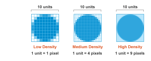
Pixel Density
Starting with introduction of the iPhone 4 in 2010 and it's "Retina" screen, the web industry been struggling to keep up with the arms race of high pixel density screens. Today we have to deal with a variety of pixel densities ranging from 1dppx to 4dppx. This means we have to be conscious of our designs and ensuring that we are delivering images and icons that are the right pixel densities and look crisp.
Understanding pixel density
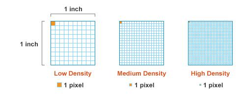
Pixel density refers to the number of pixels that fit in an area of a screen. Traditionally, we only had to deal with one pixel density (1dppx). 5 pixels would more or less look like 5 pixels on every screen. You could count on the idea that a physical screen size directly related to it's resolution and number of pixels it could display.
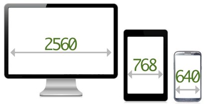
On the iMacs, check the screen resolution. The native resolution is 1920x1080. These can hold 1920 pixels across. We used to be able to assume that smaller screens would have smaller native resolutions. Smaller physical screens used to represent smaller pixel resolutions.
This changed with the introduction of Retina screens.
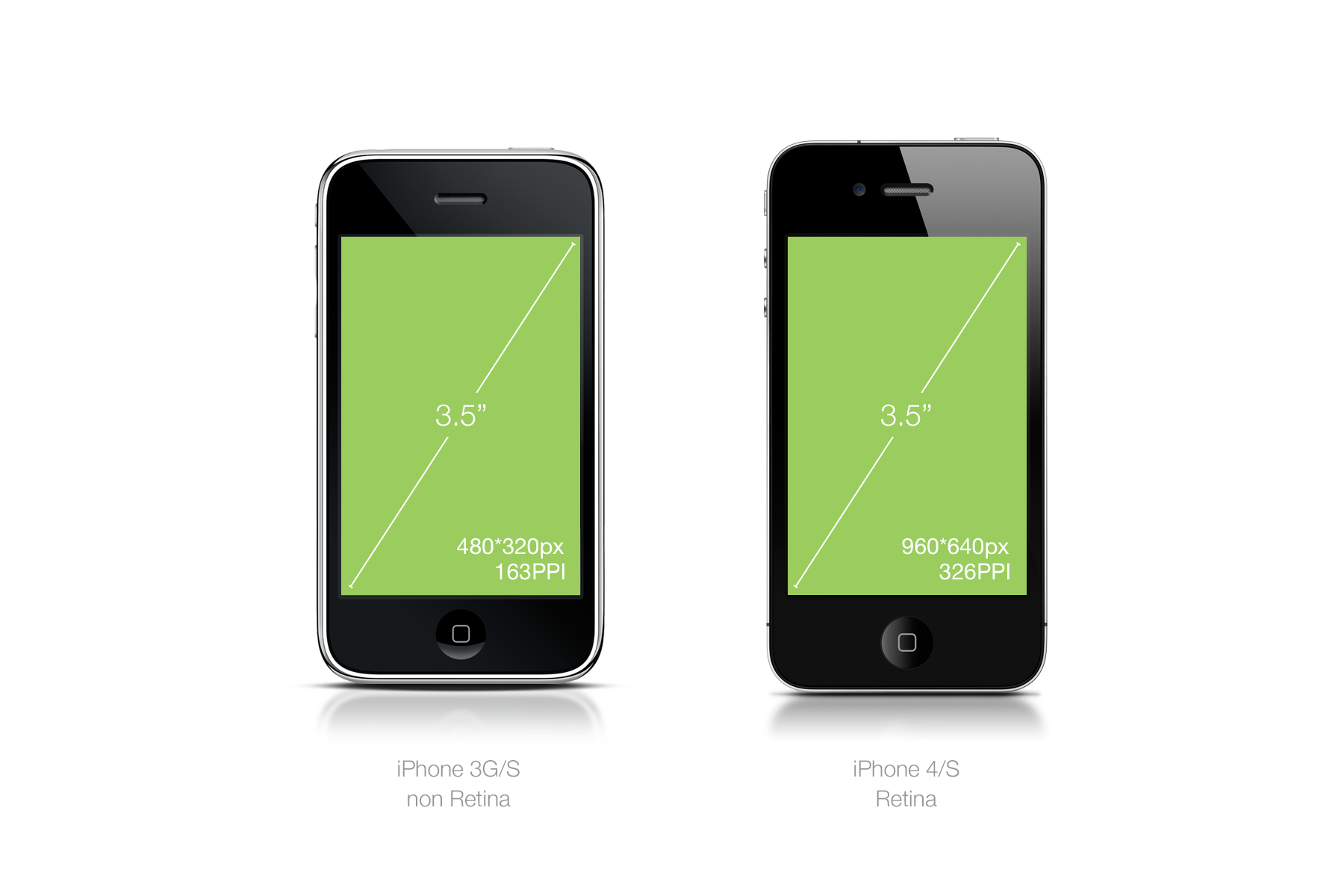
Even though the physical screen sizes of the iPhone 3s and iPhone 4 were exactly the same, the iPhone 4 had twice the pixel density and therefore 4 times as many pixels. We refer to this as having 2dppx (dots per pixel unit). Now we have devices that are 3dppx or even 4dppx.
In the same physical size, we can have varying size densities of pixel units.
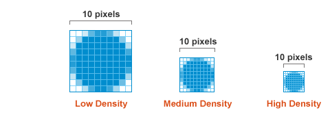
Because of this fact, a graphic that displays at 100% on a 1dppx screen will actually be smaller on a higher dppx screen.
In order for the higher dppx screen to display the image at the same physical size, the image will actually be scaled up and result in a slightly fuzzy graphic. Below is a simulated example.

To resolve the fuzziness, we must serve images with higher pixel densities. This means creating larger images that then will get smushed down to the right physical display size. The fuzziness will be most obvious in things like icons and other user interface elements
Icon Example
Three different sized logos (100px, 200px, and 300px wide):
The same three logos except now we explicitly define the width and height in the HTML.
Here they are again, but at a slightly larger size to make it easier to see the differences.
And again.
Pixel Density Demos
Below are examples of images set to render at different pixel densities. You'll need to view them on a variety of screens to get the full effect. Note: since the classroom iMacs have a dppx of 1, you should not notice much different in these examples.
- Side by side comparison of images at between 1, 2 and 3 dppx
- Another side by side comparison (1 photo)
- Demonstration of high pixel densities for three types of images: photo, illustration, vector icons
- Extra High DPI Demo (1x-4x)
- Extra Large Photo Demo (click swap photos)
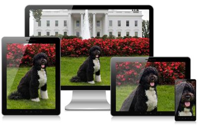
Variety in Screen Resolutions
Often in a design we'll need different sized images for different sized screen resolutions. A good example of this is if we're using a full screen image. We'll need a much larger image for a large screen than a small screen.
Without some sort of responsive image approach, we'll end up with one of two solutions:
- Send a large image to everyone resulting in unnecessary downloads
- Send a small image to everyone resulting in reduced quality for some
Niether solution is really acceptable although the first one is more commonly used. Responsive images aim to fix this, but the solutions are still in their infancy.
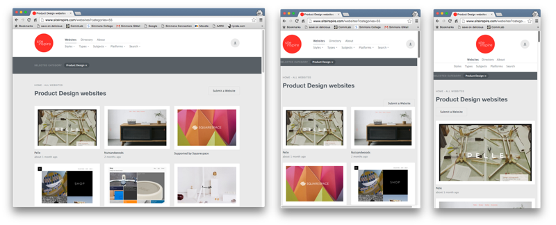
Differences Dictated by Media Queries
Often in our responsive designs we don't actually end up using the largest images on our large screens. This is because our designs often involve some variation in the column drop pattern.
In the example below, the largest images are actually used on the small screen design.
Art Direction
Sometimes an image does not work quite the same at various sizes. You might want to focus on different elements of the image based on the screen real estate.
Another example of how you might want to crop an image at various sizes.