Print Stylesheets
Using media types in our CSS media queries, we can create special styles for print.
@media print  {
  /* These rules only apply to the page when printed */
}
You'll generally want to add these styles at the very end of your stylesheet, so the are the last to take effect. This way we can easily override any other styles we need to.
Preview Your Print Stylesheet
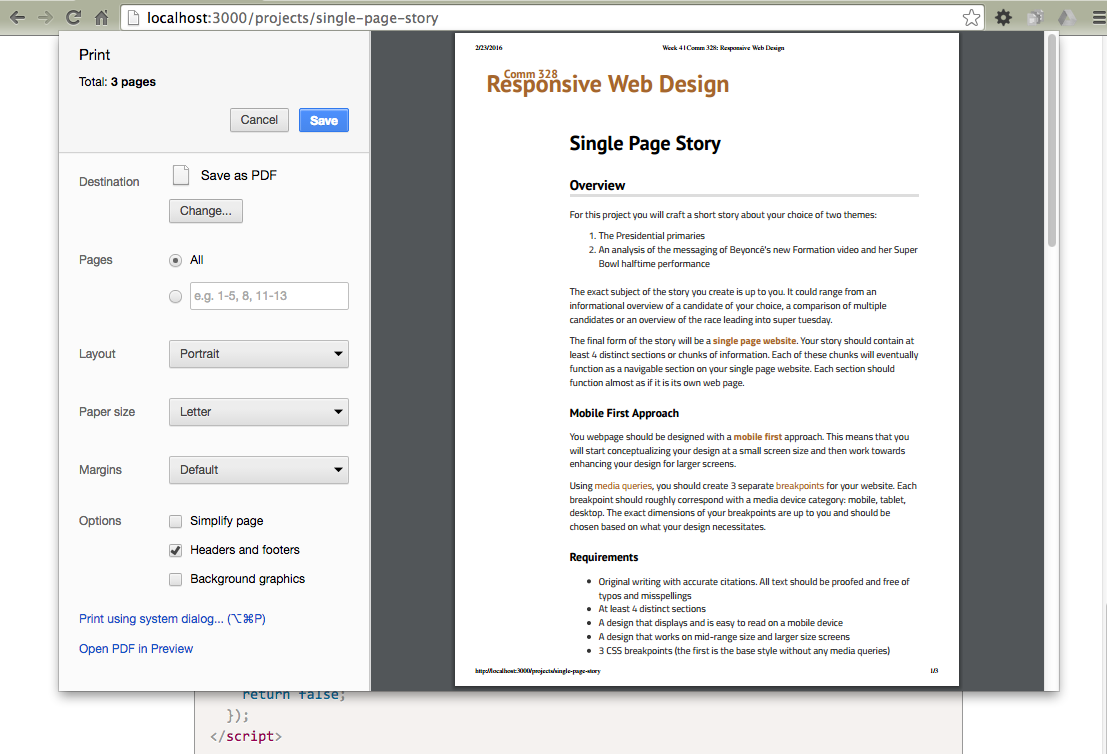
To see your print stylesheet in effect, you can click print and view the preview image of your page. This will give you a good idea of how it will look. For best results, print the actual page.Important!
It's possible that you may need to override a lot of other styles when writing your print stylesheets. In this case, it may be necessary to use the CSS keyword !important. This makes the style the most important rule and it will override all other conflicting styles. For this reason, we use it almost never. This is one of the few times it's acceptable to use it.
@media print  {
  .sidebar {
    display: none !important;
  }
}
Get Rid of the Cruft
You usually want to focus on your actual content for the print stylesheet. If someone is printing your page, make sure that what gets printed is usable and without a lot of extra elements that waste ink and papper.
This means getting ride of all extra things by setting them not to display.
- Page navigation
- Sidebar (if it has ads and more navigation)
- Maybe extra video elements?
- Extraneous footer information
You likely don't want to get rid of all of your site branding or copyright information, but there is probably a lot of extra stuff we can remove.
Your styles might look something like this:
@media print  {
  #main-nav,
  .sidebar,
  .footer-nav {
    display: none;
  }
}
Set page margins and type sizes
When printing, it's a good idea to set up page margins that are going to be comfortable for reading. You can also set the font size of various elements. Since the destination is for print, it's actually okay to finally use those absolute CSS measurements. Make sure your content width is also set to cover most of the page.
Also consider resetting some of your text colors to black if it's not absolutely necessary for them to be in color. This may save some color ink for anyone who prints your page.
@media print  {
  body {
  	font-size: 11pt;
  }

  main {
    float: none !important;
    margin: 0 2% 0 18% !important;
    width: 80% !important;
  }

  /* Reset colors */
  h1, h2, h3, h4, h5, h6 {
    color: #000 !important;
  }
}
Display Link URLs
A common technique for links in print stylesheets is to display the URL after the text. Normally, when you print a page, the link URL will not display, leaving it impossible to discern where a link might have gone. This technique solves that. There are lots of variations. Below is a simple version that displays all external links (either http or https). We also need to add a rule to make sure that a really long link will break somewhere.
@media print  {
  main article a {
    word-wrap: break-word;
  }
  main article a[href^="http://"]:after, main article a[href^="https://"]:after {
    content: " (" attr(href) ")";
  }
}
Print Stylesheet Example
The print stylesheet for this site is quite simple.
@media print  {
  .container>aside {
    display: none !important;
  }

  body {
    font-size: 11pt;
  }

  main {
    float: none !important;
    margin: 0 2% 0 18% !important;
    width: 80% !important;
  }

  /* Reset colors */
  h1, h2, h3, h4, h5, h6 {
    color: #000 !important;
  }
  footer {
    position: static !important;
    border-bottom: #333;
  }

  .container {
    margin: 0 !important;
  }

  main article a {
    word-wrap: break-word;
  }
  main article a[href^="http://"]:after, main article a[href^="https://"]:after {
    content: " (" attr(href) ")";
  }
}
Further Reading
To learn more about print stylesheets, check out the Smashing Magazine article on them.